Death to PowerPoint!
OK, well, not total death…PowerPoint presentations, aka slide shows, might be great for making funding presentations or showing graphs, cartoons, charts, or other illustrations to a group of people.
But as a teaching tool, they are, more often than not, a crutch used by untrained presenters. They are boring, confuse the learner and don’t provide any sort of interactivity between the learner and the presenter.
Let me explain…
Most teachers and presenters are aware of the three basic ways people take in, and process, information: visually, auditorily and kinesthetically. This is often referred to as VAK.
Visual is through our eyes.
Auditory is through our ears.
Kinesthetic is with our bodies and emotions.
The challenge in education has been that for decades, most education is done auditorily, i.e., someone stands up in front of a group of people and talks about a subject. The problem with this is that a very small percentage of human beings learn this way. Most of us learn visually or kinesthetically, or a combination of those two or perhaps even all three.
Download this handout for a nice reference guide to the three learning modalities.
The entire reason we teach in the first place is so that our participants have the opportunity to learn. But it’s not just learning that we have to be concerned with; we must make sure that the learner remembers the information so that they can retrieve and use it later. I call this process “making the information STICKY” and suffice it to say, slide shows are not a sticky teaching tool…but flip charts, as you’ll see below, are.
The Problems With PowerPoint
The problems with PowerPoint or any computerized slide show, like everything else, come from how you use it.
IF you put your entire talk or presentation on it, slap it in front of your group and read it aloud, you’re using it wrong. This is a lazy or untrained person’s excuse for a presentation. Your visual learners don’t know whether to watch you or the slide show. Learners also tend to think they have to write everything down and then they miss what you’re actually saying.
Your auditory learners are torn because they WANT to and NEED to listen to you but now they have this visual content that competes for their attention. They think they have to look at it so they don’t hear what you’re saying either.
Your kinesthetic learners are just bored out of their minds!
IF you use bullet points to outline your talk and fill in the blanks while you’re presenting, this is only slightly better; you’re still using it improperly for the reasons stated above.
IF you use it to throw up an occasional joke or cartoon, pie chart or graph or photos of some sort, now you’re using it properly.
But what if there was an easy-to-use teaching tool that allowed you to make everything you taught ‘sticky’ for your learners and allowed you to teach to all learning styles? Wouldn’t you want to learn to be an expert with this tool? Great…I was hoping you’d say that.
ENTER…The Flip Chart and Big Fat (sometimes smelly) Markers
Why a flip chart, you’re probably asking. Isn’t the new technology better? The answer is flatly, No!
The flip chart is, by far, the most effective teaching tool available to teachers…for many reasons…primarily because it helps you teach to all learning styles and gives you options that slide show presentations simply can’t provide.
For your visual learners, it provides color, words and images that become memorable pictures in their minds and, hence, easy to remember. And, since you’re standing in front of the flip chart to write (see below), they can’t wait to read what you have written.
For your auditory learners, because you’ll have everyone read what you wrote on the flip chart, they get a chance to not only hear the information but say the information themselves, which helps make the information sticky.
For your kinesthetic learners, they experience the movement in the actual creation of the words and images and this helps them remember the information at a deeper level. The information becomes visceral in a way.
Flip Chart Supplies
To get started, you’re going to need a few basics flip chart supplies:
1) Flip Chart Stand or Easel:
Invest in a big, sturdy flip chart stand if you’re doing presentations in one place and don’t have to lug it around. Otherwise, buy a nice sturdy metal easel with telescoping legs and remember to KEEP THE BOX. It makes traveling with your easel so much easier.
Note: Don’t let other people help you set up your easel because it will eventually end up broken by someone who couldn’t figure out how to work it. (Ask me how I know this!)
2) Flip Chart Paper
Flip chart paper comes in many styles and thicknesses and is usually 27″ wide by 34″ tall. Here are my recommendations from years of trying them all.
Regular, non-lined flip chart paper: comes in various thicknesses and number of sheets to a pad. For regular presentations, this is the best way to go. If you’re going to be drawing lots of pictures or diagrams, choose a heavier paper. If not, the regular weight paper works just fine.
Lined flip chart paper: though I have never had the occasion to use lined flip chart paper, I can think of many uses for it. If you’re going to be drawing technical images, maps or anything else that requires a lot of straight lines, this might be a nice option.
Graph flip chart paper: again, I’ve never used it but it would be great if you’re working at home with technical drawings for a presentation to a small group.
Self-stick flip chart paper: imagine a large sticky note…this is what you have with flip chart paper that has a self-stick back. The entire sheet isn’t self-stick, just the top few inches. It is either just adhesive (sticky) or some flip chart pads come with the sticky part covered with a piece of paper, like envelopes where you tear off the paper to seal. This type of paper can be great for short presentations where you want to put the paper on a wall and aren’t allowed to use masking tape.
Notes:
The cost of self-stick flip chart paper is a lot higher than regular paper.
If you’re going to be using a lot of sheets during the course of your day (and flipping over each piece as you move to the next), do NOT use this type of paper. The sticky part keeps the pages from flipping completely over and they get messed up. You’ll end up with a lot less hair at the end of the presentation:-).
TIP: Buy online and in quantity. Staples has a good deal on a 4-pack and you can even order it from the comfort of your own home or office and they’ll deliver it.
3) Flip Chart Markers
The most important things about markers is that they need to be FAT. Markers for use with flip charts are different than markers used on dry erase boards. Generally you will need four basic colors: black, blue, green and red. There are specific ways to use the colors and we’ll get to that below.
Here are some options you might want to try:
Pilot Markers are a great marker for the job. The cheapest place I have found them is at PenCity.com and they are refillable so you aren’t throwing away the markers when they run out of ink…you just keep filling them up (and do THAT on a piece of paper and do NOT wear white when doing this:-).
Note: Pilot markers must be used in a large, well-ventilated room as they are not non-toxic. See the next choice.
Zig Posterman Big and Broad Markers are paint-based and non-toxic. The come in lots and lots of colors and even though you only need the four basic colors I mentioned, it certainly can’t hurt to have some fun colors for emphasis.
Sarah Singer-Nourie uses them and I’m about to order my first set. They look amazing. Here’s a link to one of the sites where I found them.
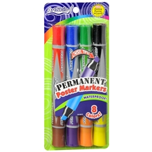
Artskills Markers are also large and they come in packs of four markers with each marker containing two colors. You will have to toss them when they run out of ink but they are non-toxic so they are easier to pack and travel. They are fun to use because there are so many colors even though you will use the dark colors most of the time.
There are other markers out there but these are my favorites. Just make sure they are thick and you get the four basic colors listed above.
4) Masking Tape
Although tape doesn’t seem like a classic flip chart supply, you will be needing masking tape to take full advantage of all of the remarkable ‘sticky’ properties of using flip charts for your presentation. Whatever you do, NEVER use any other type of tape because they will pull the paint from the walls, or worse.
There are different types of masking tape: regular buff color, blue (aka painter’s tape) and green. My favorite is the normal, every day buff colored masking tape. Buy it online in quantities or go to your local hardware box store and head for the paint section.
TIP: If where you’re doing your presentation doesn’t belong to you, ALWAYS get permission from the owner or manager to put the flip charts on the walls prior to reserving the room or ask your host if it’s OK. Sometimes they will initially say NO but you can explain that you only use masking tape and that you’ve never damaged a single wall.
Flip Chart Techniques
OK, now let’s get to the good stuff…how to actually use the flip chart in your presentations and knock the socks off your competition.
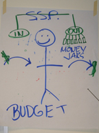
1) First, and foremost, it’s critical to PLAN your flip charts. Yes, we all create them on the fly as well, and you’ll get really good at this in time, but it’s important to know what you’re putting on each page. The mistake many presenters make is putting too much on each sheet. The flip chart illustration (words and/or simple images) is meant to highlight and emphasize what you’re talking about.
Note about pre-drawing flip charts: many people want to pre-draw their flip chart pages to save time during the presentation but now you understand why this isn’t advisable. This doesn’t mean you can’t pre-draw a few of them but make sure you leave the important information out. Draw a line for missing words or leave out a missing part of an illustration that you can add in during the presentation, creating the movement that is so necessary for learning to occur.
2) Next, it’s important to PRACTICE drawing your flip chart pages. I have drawn the same illustrations over and over again so have them memorized. I know exactly where to start the words, place a cute illustration, etc. and I only got good at it from repetition. Practice, practice, practice.
3) Use two colors on each of your flip charts, preferably using the darker colors, black, blue and green. If you need a third color, use the red to underline or circle as emphasis.
Note: Use the FAT side of the marker as thicker letters and lines are easier to see.
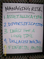
4) Use ALL CAPS when writing on the flip chart. It’s easier to read with ALL CAPS but remember, you’re not writing long sentences, just a few keywords to lock the information into their brains.
5) When making a list, keep the words to a minimum and alternate between two colors. In other words, one line is blue, the next line is green. Go back and forth between the colors. This technique takes more work but it is infinitely easier for your participants to read. If you use all one color to make a list it becomes one big blurry mass of color.
6) When writing on the flip chart, stand in front of the chart to provoke curiosity in your learners. They want to know what your writing and are busy guessing in their brains. This is a good thing.
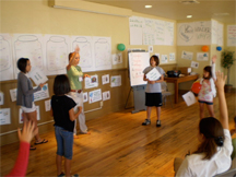
7) After you finish with whatever it is you’re putting on the paper, stand to the side and have your participants read what you wrote, if it’s that type of chart. Do NOT read it to them. The whole point is to have THEM read it aloud to help make the information sticky.
Sarah Singer-Nourie, co-author of Quantum Learning, teaches trainers a little tune for remembering to “stand by your content” (can’t sing here in the blog so you’ll just have to trust me!) and the reason you do this is because if you walk away from the chart, your visual learners have no idea where to put their focus.
8) When you’re finished with the topic, do a quick review asking someone in the room to explain the flip chart to their fellow participants or have them pair up and share the information with their partner.
9) A fun way to flip the paper over each time you need a fresh sheet is to get your students to do some type of action or sound. We use a drum roll where they use their hands on their laps or books and when we flip it over, we say, “and…………clap!” right at the end. It keeps the energy high in the room and it’s a lot more fun than watching us flip the pages over all day long.
9) If you have help, and you’re doing an all-day event, put the flip chart pages up high on the walls of the room, starting in the front right corner on the right hand wall (as participants see it). Keep them in order of presentation because that helps your learners compartmentalize the information. If you’re doing a multi-day event, put the charts up at the end of each day so they are visible to your participants as they walk in the following day.
You want the pieces of paper as high as you can on the wall so that participants have to look up to see them. This helps lock the information in their visual memories as pictures and makes them much easier to retrieve later. This is one of the most important benefits of using flip charts. You can’t do this with a slide show and you can’t do it with the new fangled computerized flip chart technology either.
10) Review. For a one-day program, provide review time after lunch. For a multi-day program, review first thing in the morning. Ask if anyone in the room knows what they can do to increase the retention rate of the information, i.e., help them remember better. Someone usually says, “Review!”
The best way to review is to have your participants partner up. Prompt them by simply saying, “Turn to someone and say ‘You’re With Me!'” Use music during this review time and give them at least 10-15 minutes. Have them walk around together to make the review active. For all types of learners, but especially your kinesthetic ones, moving around the room helps them lock the information in.
And, to keep them from continually asking you to explain or clarify a flip chart, teach them the saying, “Ask three before me.”
When they are finished, turn off the music, instruct them to thank their partners and have a seat.
Lastly, please remember that your flip charts don’t have to be perfect…they have to be remember-able! By giving some thought to the information you want to emphasize and the key points and key words you want them to remember, you’ll be able to create powerful flip charts for your participants.
Final Note: Spelling on flip charts doesn’t count! The reason for this is that when you’re writing letters this big, they cease being letters to words and start becoming pictures so your brain has a harder time remembering how to spell. I tell my group up front that Spelling Doesn’t Count and I tell them why. This way when I stumble on a word, I just ask for their help…and bingo, more participation and more learning!

Click here for more information or if you’re ready to
order your copy of The Money Game!

Hi!
I am currently a student at the university of north west. I have a 15 minutes presentation for a job position and don’t have the case study yet. I am sicking advise on how to prepare for the presentation and hoe go about it. The presentation is done by making use a flip chart format.
A very intelligent article Elisabeth…..really loved reading it 🙂 I am saving this as a book mark…